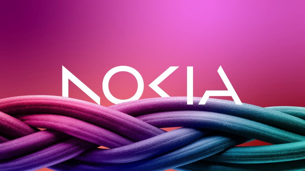
Nokia, the Finnish multinational company known for its telecommunications and mobile phone products, recently unveiled its new logo design (for the first time in nearly 60 years), which has sparked both positive and negative reactions. The updated logo reflects Nokia’s shift towards new technology areas such as 5G, cloud computing, and the internet of things (IoT), while also emphasizing its commitment to sustainability.
Nokia’s new logo: sleek and modern.
The new logo features a bold, modern font with an extended “k” that tilts to the right. The brand’s signature blue color remains but is now a darker shade. The sleek design is meant to convey innovation and sophistication and aligns with Nokia’s new strategic focus. Among others, this rebranding operation is here to remind the world that the company doesn’t develop mobile phones anymore.

Some people have praised the new logo for its modern look and emphasis on innovation, while others have criticized it for being too generic and lacking the personality and charm of the old logo. Additionally, some have questioned whether the new design accurately represents Nokia’s heritage and history.
However, the rebranding effort is a significant step forward for Nokia as it seeks to establish itself as a leader in new and emerging technologies. The company’s renewed focus on sustainability is also a notable aspect of the new logo, as it reflects a growing trend in the tech industry towards environmentally conscious practices.
The rebranding effort is not just limited to the logo. Nokia has also launched a new visual identity and a new website to accompany the updated logo. The website features a minimalist design that puts the spotlight on Nokia’s new focus areas and emphasizes the company’s commitment to sustainability.
Nokia’s new logo is part of a broader strategy to reinvent the company and adapt to the changing technological landscape. The company has been investing heavily in 5G technology and is positioning itself as a leader in the field. Additionally, Nokia has been expanding its product offerings to IoT devices, cloud services, and network infrastructure.
Nokia, connecting people… and nature.
Nokia’s new logo is not just a visual representation of the company’s updated brand identity; it also reflects the company’s renewed focus on sustainability. The sleek and modern design of the logo is meant to convey innovation and sophistication, but the darker shade of blue is also a nod to Nokia’s commitment to environmental responsibility. The company has set ambitious targets to reduce its carbon footprint and become carbon-neutral by 2030, and the new logo reflects this focus on sustainability. The updated brand identity is also part of Nokia’s broader strategy to position itself as a leader in new and emerging technologies, including those that promote sustainability and reduce the environmental impact of technology. By aligning its brand identity with its environmental goals, Nokia is sending a clear message to its customers and stakeholders that it takes its responsibility to the planet seriously.
While Nokia’s new logo has generated mixed reactions, it represents a significant step forward for the company as it seeks to establish itself as a leader in new and emerging technologies. The sleek and modern design of the logo aligns with Nokia’s new strategic focus, while the emphasis on sustainability reflects a growing trend in the tech industry. #3310Forever!


I’ve been browsing online more than 4 hours today, yet I never
found any interesting article like yours. It’s pretty worth enough
for me. In my view, if all website owners and bloggers made good content
as you did, the internet will be a lot more useful than ever before.