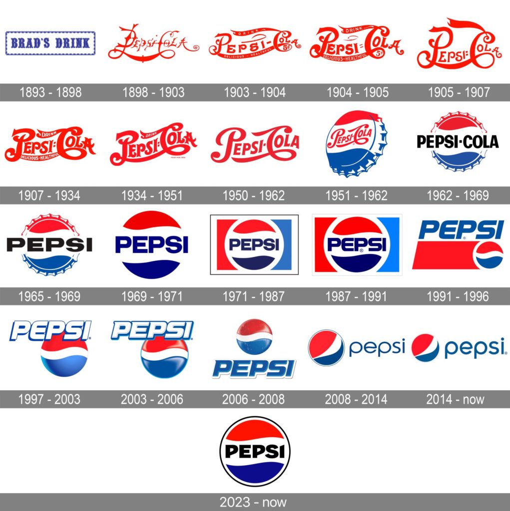
Pepsi, one of the world’s leading soda brands, recently unveiled its new logo design after 14 years. The redesign aims to capture the brand’s timeless spirit while also embodying its current identity.
The Circle Shape Gets a Modern Twist
The new Pepsi logo design maintains the brand’s iconic circle shape, which has been a part of its branding since the 1940s. However, the designers have given the circle shape a more dynamic and modern feel by shifting it to a more forward-leaning angle.

A New Color Palette for a Contemporary Look
The red, white, and blue colors have also been updated, with a deeper shade of blue and a brighter shade of red, giving the logo a more contemporary look.
Simplicity and Minimalism Take Center Stage
One of the key aspects of the new Pepsi logo design is its simplicity. The design team has stripped away unnecessary elements to create a clean and minimalist logo that is easily recognizable. The new logo also features a new font that is bold and modern, giving the brand a more youthful and energetic vibe.
Adaptability for Modern Branding
One interesting feature of the new Pepsi logo design is its ability to adapt to different situations. The logo has been designed with flexibility in mind, making it easy to use across a variety of media and platforms. This adaptability is an essential aspect of modern branding, allowing brands to be easily recognizable and consistent across different touchpoints.
Positive Reception from Consumers and Experts
The new Pepsi logo design has been well-received by consumers and branding experts alike. The design has been praised for its ability to capture the brand’s timeless spirit while also embodying its current identity. The logo’s simplicity and flexibility have also been commended, making it a strong contender for modern branding.

The new Pepsi logo design is a testament to the power of simplicity and flexibility in modern branding. The design captures the brand’s timeless spirit while also embodying its current identity, making it easily recognizable across different touchpoints. The new logo is a great example of how a brand can evolve and adapt to stay relevant while still staying true to its core values.
Ready to revitalize your own brand? Check out our article on ‘Revitalizing Brands: The Power of a Branding Refresh’ for more insights on how to refresh your brand’s identity and stay relevant in today’s market.


