In the fast-paced digital world we live in today, a well-designed logo can be the key to establishing a strong brand identity that stands out from the competition. Logo design trends are constantly evolving, and it’s important to stay current to ensure your brand remains relevant and engaging. In this article, we’ll explore some of the current logo design trends and how you can integrate them into your online logo maker to create a logo that not only looks great but also accurately represents your brand.
Minimalism
One of the biggest trends in logo design right now is minimalism. A minimalist logo is simple, clean, and uncluttered. This trend is popular because it is both modern and timeless, and it allows the logo to be easily recognizable and memorable. To integrate minimalism into your online logo maker, focus on simple shapes and clean lines. Use a limited color palette and avoid using too many details or embellishments.
One of the biggest trends in logo design right now is minimalism.
John O’neill
Geometric Shapes
Geometric shapes are another popular trend in logo design. These shapes are simple and clean, yet they add visual interest and dimension to a logo. Geometric shapes can be used to create abstract designs or to represent specific objects or concepts. To integrate this trend into your online logo maker, experiment with different shapes and angles. Use shapes to create unique designs that are both visually appealing and easy to remember.
Gradients
Gradients are a popular trend in logo design because they add depth and dimension to a logo. A gradient is a gradual change from one color to another, and it can be used to create a variety of effects. Gradients can be used to create a sense of movement, to add a pop of color, or to create a more complex design. To integrate gradients into your online logo maker, experiment with different color combinations and gradients. Use gradients to create unique designs that stand out from the competition.
Handwritten Fonts
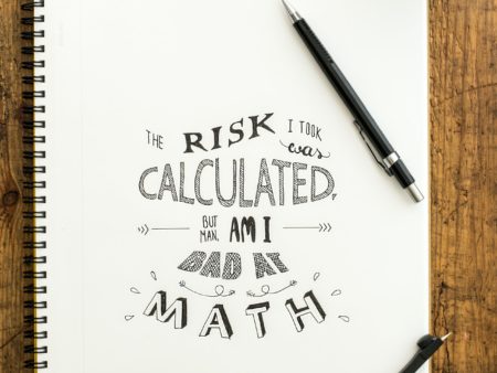
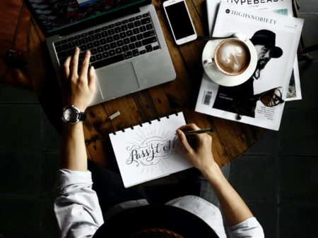
Handwritten fonts are becoming increasingly popular in logo design because they add a personal and human touch to a logo. Handwritten fonts are informal and casual, and they can be used to create a sense of warmth and friendliness. To integrate handwritten fonts into your online logo maker, experiment with different fonts and sizes. Use handwritten fonts to create a unique and personal logo that reflects your brand’s personality.
Negative Space
Negative space is a popular trend in logo design because it adds an element of surprise and intrigue to a logo. Negative space is the area around and between the main elements of a logo, and it can be used to create hidden images or to emphasize certain aspects of the design. To integrate negative space into your online logo maker, experiment with different shapes and angles. Use negative space to create unique and memorable designs that are both visually appealing and clever.
Negative space is a popular trend in logo design because it adds an element of surprise and intrigue to a logo.
John O’neill
Flat Design
Flat design is a popular trend in logo design because it is simple, clean, and easy to read. Flat design uses a minimalistic approach, with no shadows or gradients, and focuses on clean lines and simple shapes. To integrate flat design into your online logo maker, focus on simple shapes and clean lines. Use a limited color palette and avoid using too many details or embellishments.
Vintage Design
Vintage design is a popular trend in logo design because it adds a sense of nostalgia and authenticity to a logo. Vintage designs often incorporate old-fashioned fonts, muted colors, and retro graphics. To integrate vintage design into your online logo maker, experiment with different fonts, colors, and graphics. Use vintage design to create a unique and memorable logo that stands out from the competition.
Accessibility
When designing your logo, it’s important to consider accessibility for all users. This includes making sure your logo is easy to read and recognizable for those with visual impairments or color blindness. To ensure your logo is accessible, use high contrast colors and clear fonts. Avoid using small or intricate details that may be difficult to see.
When designing your logo, it’s important to consider accessibility for all users.
John O’neill
Brand Consistency
While it’s important to stay current with logo design trends, it’s also important to maintain consistency with your brand identity. Your logo should accurately reflect your brand’s personality, values, and mission. When integrating design trends into your online logo maker, make sure they align with your overall brand identity and don’t stray too far from your established brand guidelines.
Versatility
Your logo will be used in a variety of contexts, from your website to your social media profiles to your marketing materials. To ensure your logo looks great in all of these contexts, it’s important to design a versatile logo that can be easily adapted for different applications. Consider creating different versions of your logo for different contexts, such as a simplified version for social media or a vertical version for use on banners or ads.
In conclusion, integrating current design trends into your online logo maker can help your business stay relevant and appealing to your target audience. By focusing on minimalism, geometric shapes, gradients, handwritten fonts, negative space, flat design, vintage design, accessibility, brand Consistency and versatility you can create a unique and memorable logo that accurately reflects your brand identity.


I never realized how important accessibility is when designing a logo. It’s great to see that inclusivity is being taken into consideration in logo design and that there are steps we can take to ensure our logos are accessible to all users.
I’ve been using an online logo editor for my business, but I had no idea that there were so many design tools available. Thanks for sharing these resources – I’m excited to try them out and create a more unique logo for my brand.
As a designer, I’ve been keeping up with the latest logo design trends, but it’s always helpful to see them broken down in an article like this. These tips are not only great for online logo editors, but also for designers who want to stay on top of their game.
I appreciate your emphasis on the importance of brand consistency when designing a logo. It’s easy to get caught up in the latest design fads, but it’s crucial to maintain a strong brand identity that resonates with customers over time.
Thanks for sharing these tips on how to integrate current logo design trends into an online logo editor. As a small business owner, it can be tough to keep up with the latest design trends, but these suggestions make it easy to create a logo that looks great and accurately represents my brand.
Pretty nice post. I just stumbled upon your weblog and wished to say that I have really enjoyed browsing your blog posts.
After all I’ll be subscribing to your feed and I hope
you write again soon!